

If you haven’t read the first chapter, you can read it here.

Answering the question of whether Congress is doing its job can feel impossible. Selecting a bill and analyzing its path through Congress might seem like a good place to start. However, even if we manage to determine the reason a specific bill didn’t make it through Congress, that tells us a story. And a story is made of politics, motive, and personality – a deep pit with no pattern at the bottom.
A single bill is a datapoint, but patterns aren’t found in a single datapoint. Analyzing multiple bills might reveal some patterns, but each bill would have its own story of motives, personalities, and politics to sift through and compare to all the other bills’ stories. Extracting objective patterns from many stories would be difficult to say the least.
So rather than taking a “bottom up” approach of analyzing individual bills, I will take a “top down” approach of looking at things in aggregate, and drill down into the details as needed. To facilitate this, I am using metrics that are externally observable, can be measured over time, and indicate whether Congress is performing its responsibilities. Choosing those metrics well is the part that matters most. As much as possible we want to use objective data to infer how, or if, the system is functioning, instead of relying on what politicians and pundits tell us.
In the first chapter I talked about investigating aviation incidents. Those failures are real, and so are the failures you’ve witnessed in government, but the comparison breaks down when we start looking at the investigation that follows. NTSB investigators arrive after a single moment of impact and work backwards until they identify what about the system was faulty. On the other hand, when we see a ‘crash’ from an act or omission of Congress, we look to our expert investigators—whatever politicians and political analysts we trust—and are surprised to learn that they don’t even admit there’s been a crash. If they do eventually admit that yes, there was a crash, they’ll ask us to consider if it wasn’t actually something good? The best possible result at least. If the experts admit the possibility that yes, it was a crash, and no, it wasn’t good, then they quickly pin the blame on a person or a group of people and demand that we hate them for the tragic accident. At no point are the experts scrutinizing the framework that allowed the accident to occur. The system keeps running, lawmakers and staff show up, and they talk and talk.
Imagine if your doctor worked this way to diagnose a health condition. Doctor: “Well, I don’t think you did collapse on your treadmill. What, you have video showing that you collapsed? Then don’t you think that it’s probably for the best? Running takes a lot of time and you could really use that extra hour in your day if you stop. What, I told you last year that you should run for your health? Oh, then the treadmill company is to blame for this. I recommend seeing a lawyer immediately to start a lawsuit. Next patient, please!”
In our diagnosis of Congress let’s start with the basic question: Is Congress even functioning? If it were a heart, would it be pumping blood; if it were a kidney would it be clearing toxins from the bloodstream?
A doctor can’t diagnose a failing system from body temperature alone. A fever suggests something might be wrong, but not what, and not even for certain. So she doesn’t reach for one test, she creates a panel. She might take vitals, order blood work, review images, and ask the patient where the pain is. She uses different instruments to get different kinds of evidence. She collects information about her patient, before working through the conditions that could produce them, eliminating the ones that fail to account for all her observations. This is what we are doing in this chapter, collecting information about Congress, so we can determine what condition it is in.
Just as elevated body temperature is a symptom of many health problems, a single measurement of Congress is consistent with too many explanations to settle anything, so we need to create our own panel of observations. And like our doctor, our observations need to be independent, otherwise they are just different versions of the same metric. Independence in observations is what allows us to cross-check them. A single metric can be “gamed” (artificially inflated or deflated), but a panel of metrics, drawn from separate sources, is much harder to fool. This method has a name: differential diagnosis, and it’s what I based this entire book on.
The list of observations and metrics that follow are not the only possible measures, but I believe these metrics, rudimentary as they are, are sufficient to answer the question of whether Congress is doing its job or not. My hope is that over time, the existing metrics can be improved, and new ones created to give us an even better understanding of the system.
As you read these observations, explanations may occur to you — maybe politicians are corrupt, maybe the districts are rigged, maybe the voters pulled apart, maybe it’s the money, maybe it’s the media. Some of these could be right. This chapter is about what has happened and what is happening, not about why the data is what it is. As much as you can, set any explanations aside, and focus on what the data is telling you. We will get to the whys, but the whys will be worth more if we first establish the whats.
Observation 1: Fewer Societal Problems Are Being Addressed
Congress’s defining responsibility is creating legislation, so looking at the volume of legislation passed is a natural place to begin. Legislation can be thought of as an attempt to solve a societal problem. Knowing whether a particular piece of legislation effectively solves a problem is nearly impossible to determine, but unpassed legislation certainly does not solve a problem. We can look at the simple count of legislation passed each session and see if it tells us anything:
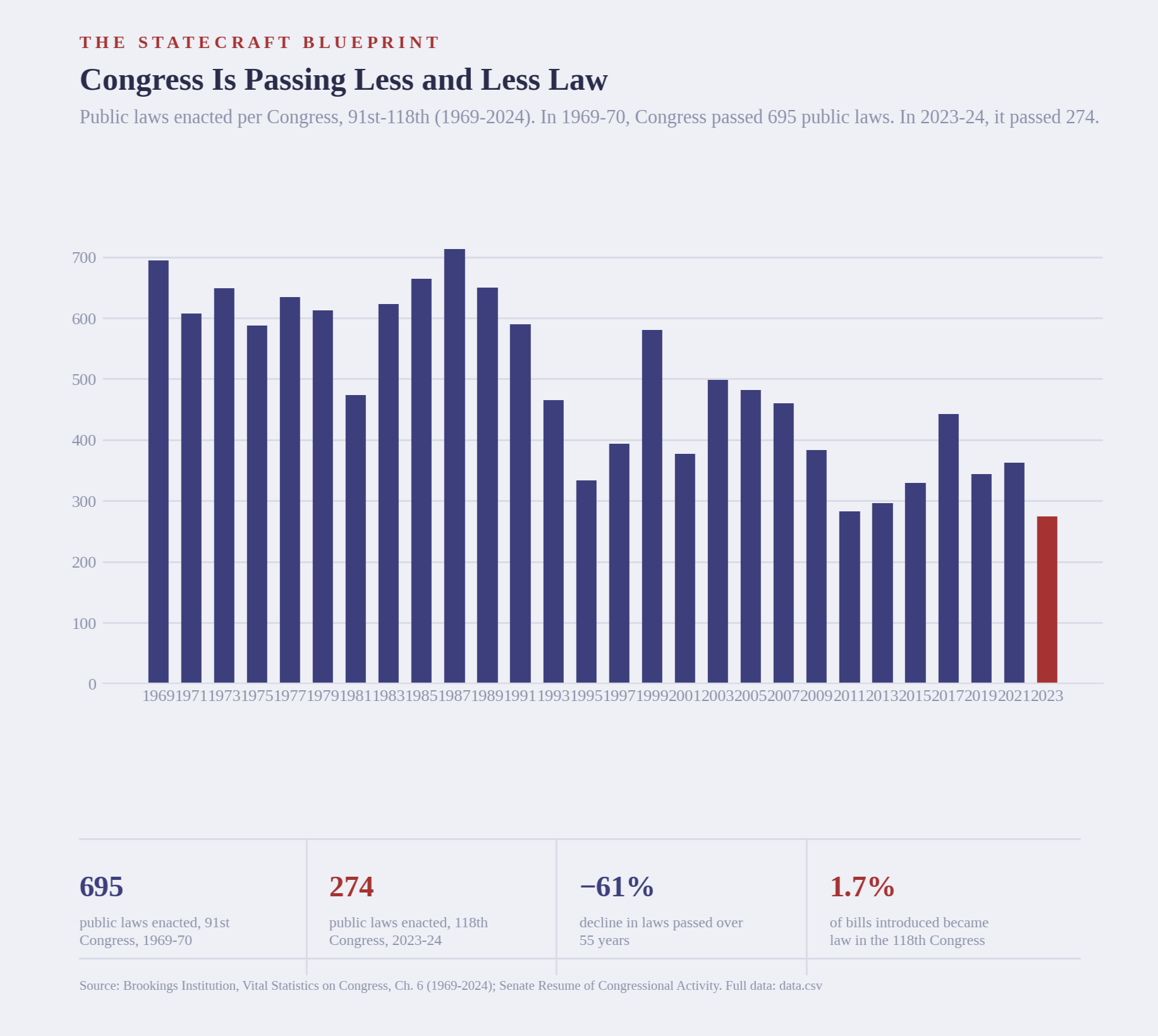
The chart above shows Congress passed roughly 695 laws in the 91st Congress (1969-1970). In the 118th (2023-2024), it passed 274.
Is that good news or bad? Some constituents might say fewer laws is a positive because fewer laws mean smaller government and less overreach. But this chart can’t tell us whether the government got smaller or curbed overreach. It only tells us fewer bills were signed into law. Fewer laws and smaller government are not the same claim.
And we can check this easily by looking at the raw size of bills:
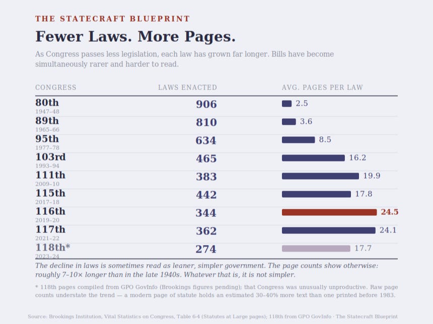
While the number of laws has trended down, the length of those laws increased, by an order of magnitude. And this table understates the situation: a modern page of legislation holds more text than a page did in the 1940s. That growth in length is the fingerprint of bundling, packing many separate measures into a single omnibus bill, and it’s one of two reasons David Mayhew argued, in Divided We Govern, that a raw count of laws isn’t an especially helpful measure. The other is importance: the count can’t tell a post-office renaming apart from the Affordable Care Act, though one is vastly more consequential than the other. A measure that misses both size and significance can’t tell us much.
Since the raw count doesn’t consider bill complexity or importance, we need a different metric. Ideally one that will tell us if the bills address our societal problems, regardless of how many bills are passed.
Thankfully, someone took the time to do exactly that. Sarah A. Binder of the Brookings Institution created a yardstick we can use to measure how many societal issues each Congress addressed. The yardstick is built of unsigned editorials published in the New York Times; once an issue drew enough editorials, it was added to the national agenda. The agenda built from the New York Times isn’t perfect, given the publication’s geographic focus and political slant, but it is independent of Binder’s personal opinions and lends itself to reproducibility.
This national agenda becomes a baseline to compare Congress’s actions against. Binder counts an issue as addressed, or “resolved”, if any bill passed mentions it. Trivial acts like renaming post offices don’t get many editorials, so they aren’t on the agenda and thus don’t get counted. If an omnibus package addressed half the issues in the agenda, then that would be reflected as an increase in the number of issues resolved. She used news media and congressional documents to judge whether Congress took legislative action – attempted to address the problem, not whether that attempt worked.
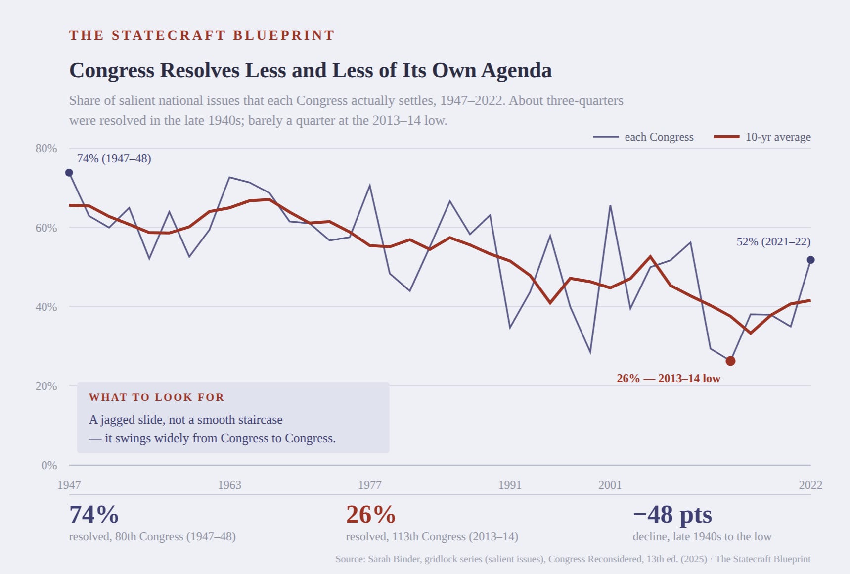
Even with her very generous definition of resolved, the portion of the agenda that Congress acted on declined from almost three quarters in the late 1940s to about one quarter in the lowest dip. The last Congress (2021-22) for which there is data was unusually productive, and the Congresses since have been much less productive.
Let’s go back to the raw count for a moment. It showed the number of bills passed has declined over the last 50 years. The reality is worse than that. Congress is still passing legislation, by some measures, more than they did decades ago, but that legislation addresses less and less of our national agenda, and fewer of the problems facing our society.
We all have lived experience with this. Immigration. Social Security. The national debt. Education. Healthcare. The list goes on while politicians campaign on the same problems again and again and again, without actually resolving them once they’re in office.
Binder’s data is a strong signal that Congress leaves most of the national agenda unaddressed, and is therefore failing to do its job. But a single measure, however good, is still a single measure. The pattern only becomes undeniable if other, independent signals point the same way — so that’s what we go looking for next.
Observation 2: Our Government Didn’t Used to Shut Down. Now It Does.
Observation 1 indicates Congress is not passing new legislation to address the problems facing our country. This second observation measures whether Congress can do its most basic, non-optional housekeeping: funding the government it has already authorized. Failing to pass new laws is one thing. Failing to keep the lights on is a different, more fundamental kind of failure.
Here’s a short primer on government funding. Broadly, there are two kinds. “Mandatory” spending is authorized by permanent law and runs on its own — Social Security is the clearest example. “Discretionary” spending has to be reauthorized by Congress every single year, and covers most of what we think of as federal agencies: education, homeland security, national parks, food inspection.
Those annual bills don’t hand money to an agency. The money already exists. What the bills provide is permission to spend it — and that permission comes with an expiration date. This is the part that trips most people up, and it’s worth being precise about, because everything else in this observation depends on it. Agencies don’t run out of money when Congress misses a funding deadline. They run out of the legal authority to touch money that’s already sitting there.
When that authority lapses and Congress hasn’t renewed it, agencies are required to stop non-excepted work. Employees are furloughed. Services pause. A carve-out keeps anything tied to protecting human life or property running — the military, air traffic control, and so on —and Social Security checks keep arriving, because that money was never on the annual clock to begin with. But all non-excepted agencies that require Congress to give them the okay to spend the money already set aside for them grind to a halt.
That’s what we’re counting: the number of times, and for how long, Congress has failed to renew that permission on schedule.
Why the count starts in 1980
One thing has to be settled before the data means anything, because it’s the obvious objection to everything that follows.
Congress missed funding deadlines before 1980 — repeatedly, including six times between 1977 and 1980. Those lapses didn’t close anything. Agencies kept working on the understanding that Congress would sort it out and make them whole afterward, and that understanding was official, not informal: the government’s own top accountant, Comptroller General Elmer Staats, had told Congress in writing that federal agencies weren’t expected to close their doors over a lapse in appropriations.
In April 1980, Attorney General Benjamin Civiletti overruled that reading. Interpreting an 1884 law called the Antideficiency Act, he concluded that spending without current authorization wasn’t merely irregular — it was illegal, and agencies had to stop. A second opinion the following year added the human-life-and-property exceptions described above. Within days of the first opinion, the Federal Trade Commission became the first agency ever closed by a funding lapse. It lasted one day.
So the honest reading of the chart is this: the lapses aren’t new. The consequence is. What 1980 changed is that a missed deadline stopped being an accounting problem and started being a shutdown which means this metric can’t tell us anything about whether Congress was better or worse at funding the government before 1980. It can only tell us what has happened since.
What the data shows
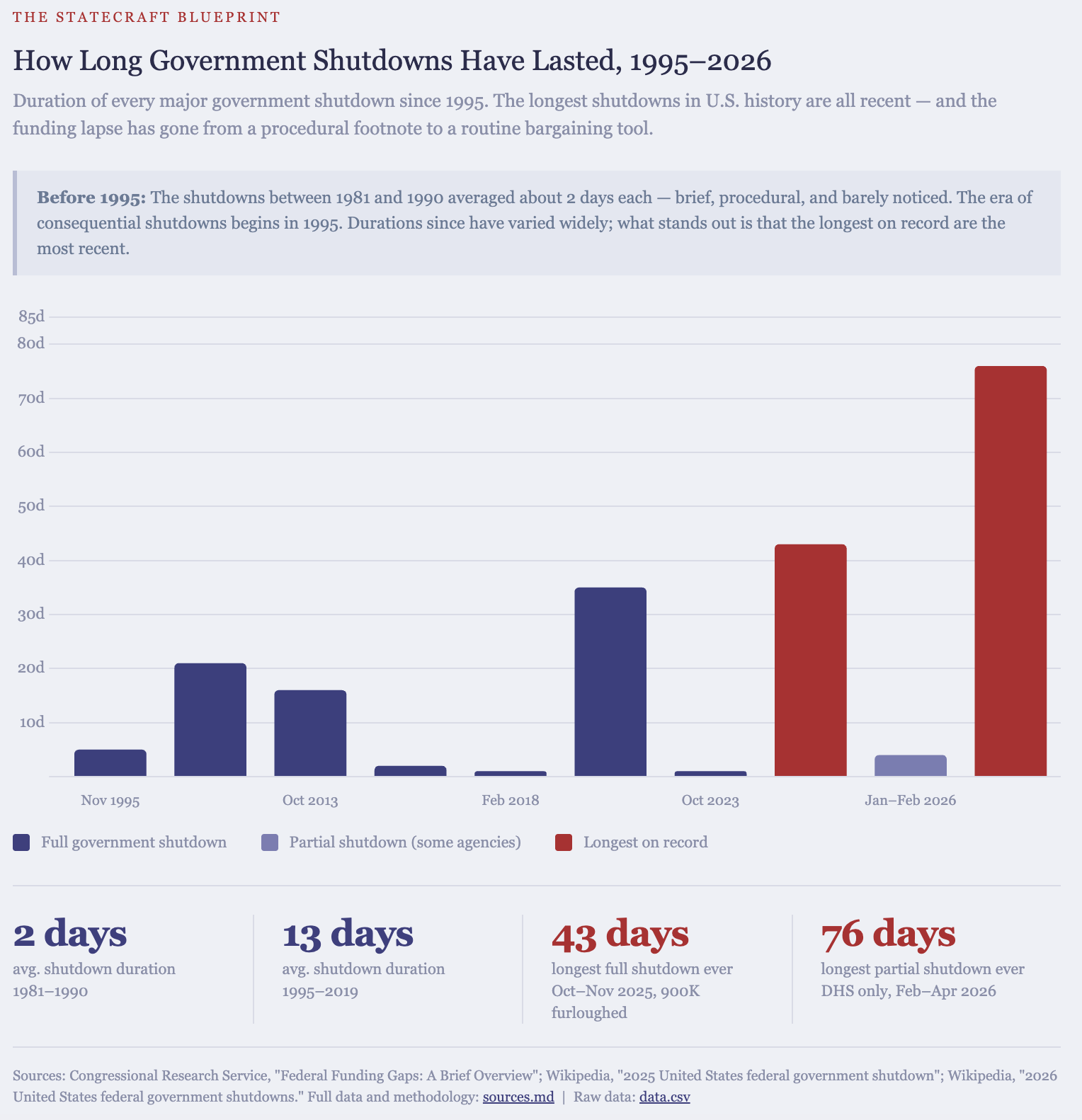
Two different things are visible.The first is frequency. Shutdowns exist at all, which they did not before 1980, and they recur.
The second is duration, and it’s the more telling of the two. Through the 1980s and early 1990s, shutdowns averaged about two days — most of them weekends, most of them invisible to anyone who didn’t work for the federal government. Then: 21 days in 1995–96. 16 days in 2013. 35 days in 2018–19. 43 days in 2025. As of this writing in 2026, the government has shut down twice in the last year, each time for over a month.
A two-day lapse and a six-week lapse are not the same event at different sizes. One is a scheduling failure. The other is a sustained interruption of federal operations — missed paychecks, halted services, contractors idled, whole agencies dark long enough for the effects to reach people who have no connection to the federal government at all. Somewhere in that progression, the thing being measured stopped being a procedural irregularity and became something else.
Why that happened is a question this chapter doesn’t answer. It’s a good question, and we’ll come back to it. For now the data supports a narrower claim: an event that didn’t exist before 1980, and barely registered for its first fifteen years, now recurs and lasts weeks.
Observation 1 showed Congress leaving most of the national agenda unaddressed. Observation 2 shows it increasingly unable to complete the one task it cannot decline — and failing at it for longer each time.
We now have two observations that measure two separate responsibilities of Congress. What else can we observe?
Observation 3: Incumbents Almost Always Win – And Always Have
In a functioning democracy, elections are the mechanism that lets voters replace officials who aren’t serving them. So it’s worth asking how often that replacement actually happens.
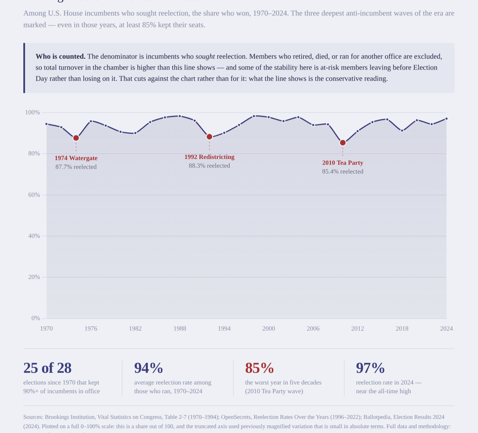
Since 1970, an average of 94% of House members who ran for reelection won. In 25 of those 28 elections, at least nine in ten kept their seats. The chart is drawn on a full scale, zero to one hundred, to give you a sense of how often we reelect the same people. Fifty-four years, and the line barely moves, the “waves” we hear about are small dips overall.
Three years are marked: 1974, 1992, 2010 — the three deepest dips in the series. Two of them are the elections people remember as the ones where voters threw the bums out, and they did shift real power. 1974 sent 49 additional Democrats to the House. 2010 gave Republicans a 63-seat gain and control of the chamber. Those are enormous political events, and they’re enormous for a specific reason: control of the House is decided at the margin. A relatively small number of seats changing hands determines which party runs the chamber.
Now look at what didn’t change. In 2010, the worst year for incumbents in the entire period, 85% of the members who ran were sent back. A wave election changes which party is in charge. It barely changes who is there.
One thing to keep in mind about what this number counts is that it includes only members who chose to run again. Members who retire, die, or leave to seek another office never enter the denominator, which means total turnover in the chamber is higher than this chart shows. That exclusion is deliberate, and it matters for what we’re measuring: retirement isn’t voters removing anyone, it’s members leaving on their own terms. What’s left is the thing we actually want to see — how often the electorate removes someone who asked to stay.
On its own, a high reelection rate proves nothing. Voters might simply be satisfied with their representatives. That’s a real possibility, and this observation can’t rule it out – this is simply data we can use later on.
Now, let’s examine how Congress is operating.
Observation 4: Party-Line Voting Happens More Often Than Not
I have talked to many people who tell me Congress has become more and more polarized. The term polarization can be difficult to define. When pressed for how they see/experience/observe this, the most common answers involve two phenomena: legislators don’t compromise, and politicians have become more extreme. Both of these can be quantified.
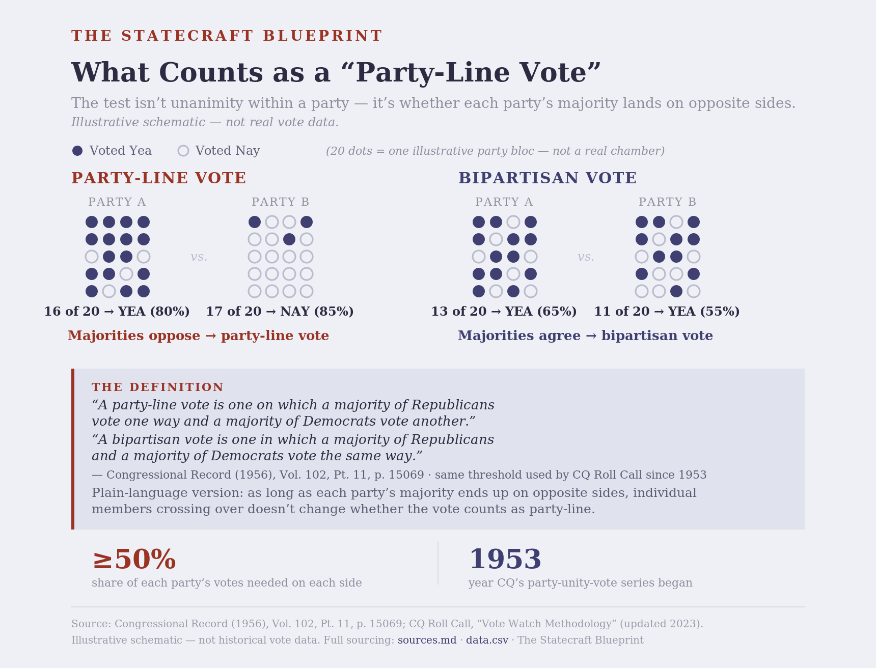
One way we can quantify “legislative compromise” is by looking at how often votes are bi-partisan versus along party lines. A bi-partisan vote is where the majority of Republicans and the majority of Democrats vote the same way. A party-line vote is when the majority of Republicans oppose the majority of Democrats.
A common misconception is that party-line votes are when members vote unanimously, or nearly unanimously, with their party. This illustration may help:
Now that we know what is meant by “party-line votes”, let’s look at the data:
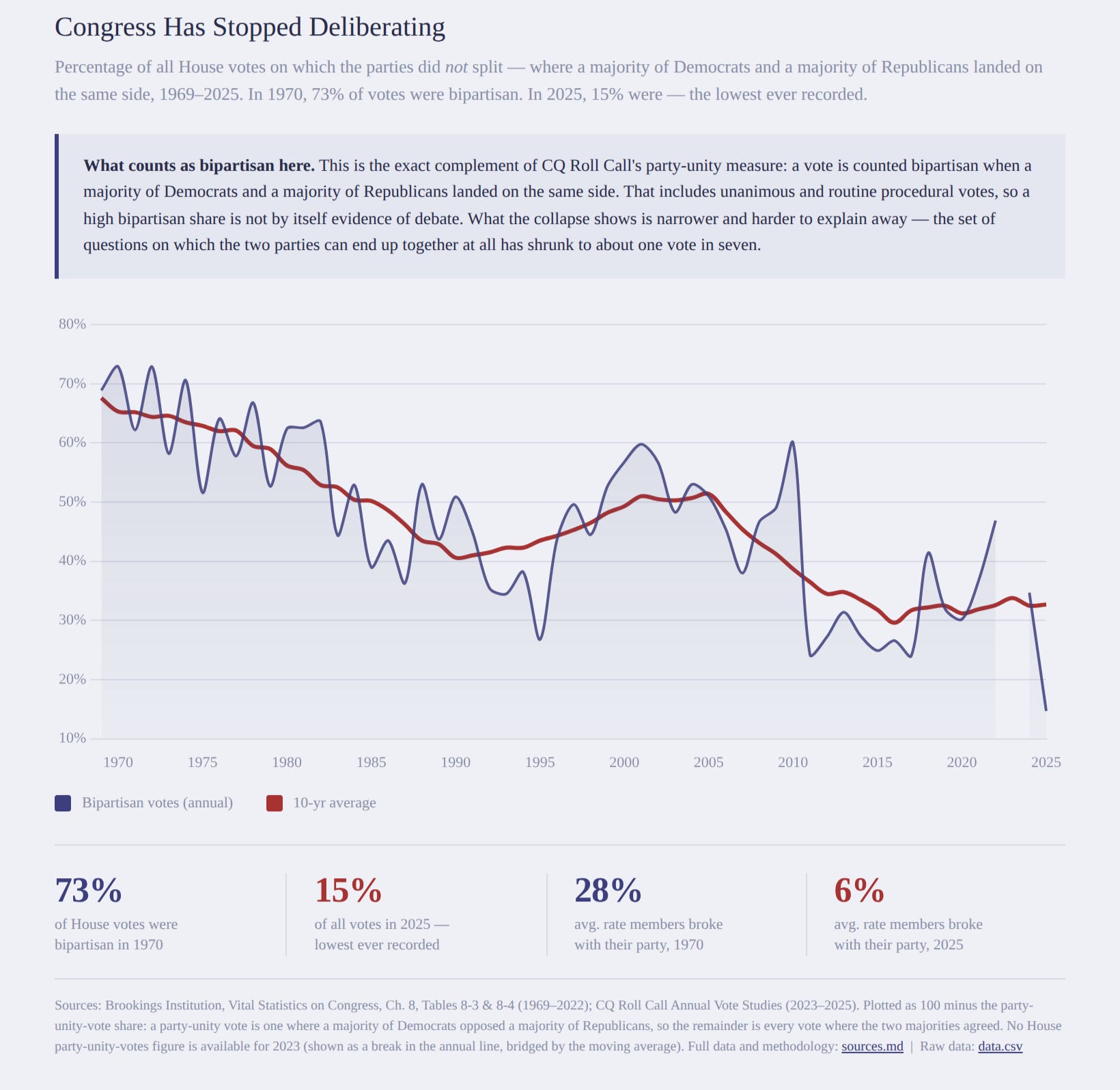
I’d like to draw your attention to the stats callouts: bipartisan votes have declined from 73% since we began recording votes, down to 15% last year, and the rate members break from their party has dropped by more than 75%. This measurement actually tells us two slightly different things. First, it tells us the parties, broadly as a whole, cannot agree on legislation. Second, it tells us that fewer members are reaching across the aisle.
Despite the small rise in bipartisan voting through the 1990s, the general trend (the red line in the chart) has gone down.
But party line voting is only one measure suggesting Congress has become more polarized.
Observation 5: There are fewer moderate members of Congress
The other phenomena referenced by people talking about polarization in Congress is that politicians are becoming more and more extreme, and there are less and less moderates. The reasons for why there seems to be fewer moderates in Congress can vary, but, again, we’re not looking for reasons and explanations – we are collecting data points.
Fortunately, data about this has been standardized and tracked for many years as the DW-NOMINATE1 dataset. Here’s a chart illustrating it:
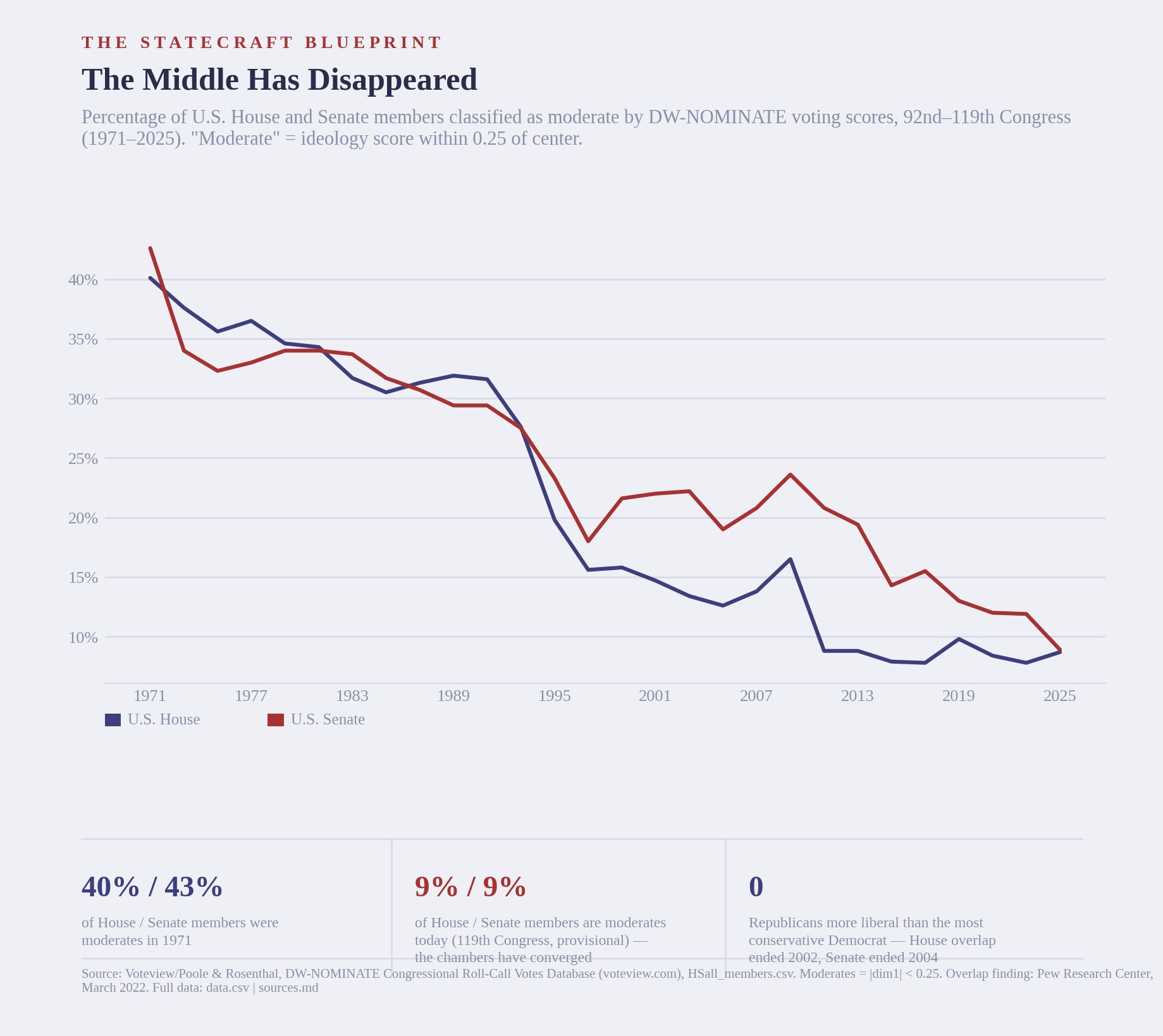
This chart is a revealed-preference measure; it is based entirely on how members actually voted. It measures how close to the center a member has voted, not necessarily where they actually stand, or claim to stand on issues/policies.In other words this doesn’t tell us whether or not the legislators we elect are actually more ideologically extreme, but it gives us a measure of whether members vote moderately or not.
And the downward trend shows that members vote more and more in extreme positions, going from roughly 40% of House members who were considered moderates to less than 10% for the last decade, while Senate members have followed a similar trend.
These first five observations all measure things directly in Congress, but there are other indirect measures as well.
When people are unwell it’s not uncommon for them to report they are doing just fine while those close to them continue to see problems. If they consult a doctor there are a wide range of reasons why they might not be honest about their own condition. In these situations, doctors can gather information from the people around them, family, coworkers, or someone who witnessed an event. This is called collateral history.
Congress is not short on things to say about how Congress is doing. Politicians put on press conferences, give interviews and floor speeches about all the problems in Congress. Occasionally they will provide useful information (which we will discuss in later chapters), but generally it’s a lot of fingerpointing and bickering. Like the doctor with an unreliable patient, we collect a collateral history.
In this case, the people around the patient are us, the citizens of this country. Which means citizen observations are part of the record, not as opinion, but as evidence. Beginning with what Americans think of how Congress is doing…
Observation 6: Constituents Don’t Approve of Congress
On its own, poll data isn’t very useful most of the time, especially if you are trying to predict the future with it. But retrospective polls can be useful in identifying patterns. Gallup has been asking Americans for their opinions on how Congress is performing since 1974.
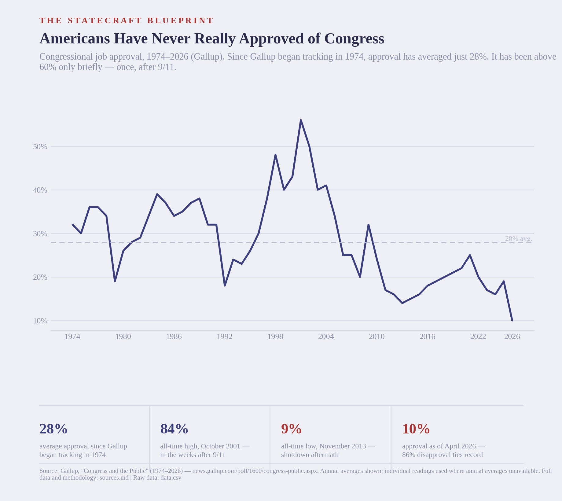
These are snapshots of Americans’ attitudes toward Congress, and generally they say the patient is not doing well. The only time it’s cleared 60% approval was in late 2001, just after 9/11. Over the last 15 years or so it has stayed below the historical average of 28%, indicating that constituents aren’t happy with the legislature.
Observation 7: Constituents Perceive Legislators Don’t Care
The Gallup Approval poll measures whether Americans like the job Congress is doing at the moment. Here’s another measure that’s very close, the American National Election Studies (ANES) data. Since the early 1950s they have asked Americans whether they agree or disagree with this statement:
“Public officials don’t care much what people like me think”
This is more specific than simply “do you approve or disapprove of Congress?” This question takes us from the overall theory of whether Congress is doing well to the specific of whether the person I helped elect cares about what I think. Let’s look at whether Americans think their elected representatives care about their interests; note that the chart shows the percent of people who disagree with the statement that public officials don’t care
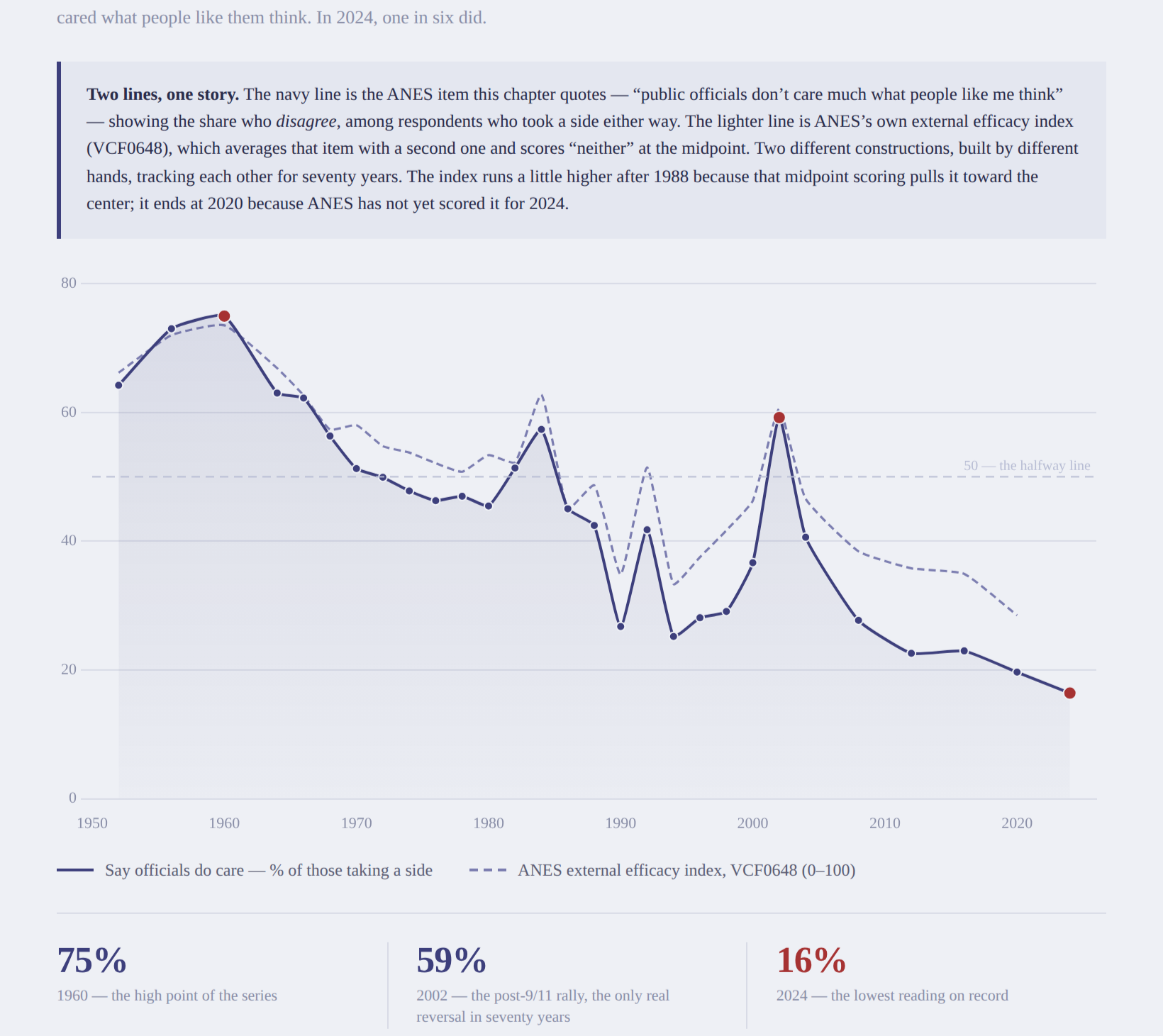
From this chart we can reasonably conclude that as time goes on fewer Americans feel as though their elected representatives listen and care about their views. Despite a few spikes in sentiment, the line has clearly trended downward since the 1960s.
Observation 8: Executive Orders Have Become “Heavier”
The previous two metrics asked the people around the patient what they’ve been seeing. This one is different. When a body part stops doing its job, another body part will often compensate; the load on underdeveloped glutes gets diverted to lower back muscles, heart muscles thicken to compensate for a failing valve. This keeps the system up and running. At least until the compensating part becomes its own problem.
So, hypothetically, if Congress isn’t passing legislation (as indicated by observation 1), what is compensating?
Enter Executive Orders.
The use (or overuse) of executive orders is a topic that comes up in the media. Depending on who’s in charge of the Executive Branch and which media outlets are explaining them, Executive Orders (EOs) can either be a weakness, bypassing Congress, or a strength and necessity as a practical way to govern when legislation is difficult.
I’m not going to weigh in on whether they are a strength or a weakness, but will simply present data showing if and how they’re used. EOs aren’t legislation in the sense the laws created by Congress are, they are formal directives issued by the President to manage how the federal agencies (executive branches and officials) will operate. They are inherently fragile; the next administration can revoke/replace them quickly. Also, because they are written by the President, they don’t have to pass through the normal legislative process. Again, this can be good or bad, depending on the context.
Counting executive orders has the same weakness as counting laws. A proclamation renaming a federal building and an order restructuring an agency both count as one. It’s the same problem we ran into with the bill count in observation 1.
Political scientists solved this the careful way. Kenneth Mayer and Kevin Price, then at the University of Wisconsin-Madison, built a measure of which executive orders were significant. Their test was, essentially: did anyone who mattered treat this order as if it mattered? They looked for press coverage and reaction from political actors (particularly the president), Congressional hearings and legislation, citations by legal scholars, and litigation. The final criteria is the only criteria examining the order itself – whether it created a new institution, changed private rights, or broke sharply from existing policy–the others measure attention. And attention is exactly the thing that fades, shifts, and depends on who’s looking.
Then I went looking for the current numbers, and there aren’t any. Their work stopped at the end of the 1990s. I wrote to Professor Mayer, now emeritus, and asked for two things: the coded list with whatever intermediate notes survived, and the operational details of how they’d applied their criteria. He replied the next morning saying “I am afraid that data has been lost to a combination of computer crashes and upgrades over the last 30 years.”
He was generous about it, and pointed me toward three other scholars who had independently coded executive orders using different criteria: Will Howell, Lawrence Rothenberg, and Adam Warber. I wrote to all three, but none responded.
I had the published classification flagged by Mayer and Price, but no coding notes and no operational rules for how to apply the criteria. The list was essentially frozen; it can be read, but not extended. If someone sat down today with a different set of 149 orders from the same period, there would be no way to know which of them was classifying them correctly. This is not a flaw in their work, it’s what expert classification is: the judgments come from the experts making them, and when the experts move on, so do their judgements, and by extension, their method.
Those who know me best will attest that I’m not very good at letting things go. I believed the last 30 years of executive orders was an important piece of the puzzle, but the existing data is 27 years out of date and can’t be updated.
So I built a different methodology.
As I reflected on Mayer & Price’s paper, my initial thinking was about how to make it more reliable. But as I pored over their paper I stumbled over this: “this process involved subjective judgments.” A major hurdle in reproducibility is subjectivity – the more subjective a process is the more difficult it is to reproduce the results.
And given my area of focus, governance structures, I’m far less interested in what the politicians and media say is important, and more interested in the impacts legislation and orders have on citizens, businesses, and most importantly, the government system itself.
Then it hit me. I already had the answer, I had developed it months earlier in my Church Bells project. The Church Bells project applies eleven fixed questions to legislative text. Does the text name a specific official or leave actors unidentified? Is every operative clause anchored to a statute? Is there an expiration date? Is there independent or review? Does it defer to judicial review?
Anyone can apply those eleven rules. Two people scoring the same order should land in the same place, and unlike a judgement call about significance, it’s a claim you can actually test. So I constructed a scoring system for Executive Orders and tested it. In a blind score against Mayer & Price’s classification across 298 orders, the rules recover 78% of the discriminating information in their expert judgement. Seventy-eight percent is a significant overlap, giving us confidence in the measure, but the ~20% is what is more interesting.
All of this work is public – the rules, the code, the validation, every order scored: https://github.com/The-Statecraft-Blueprint/eo-structural-weight/tree/main
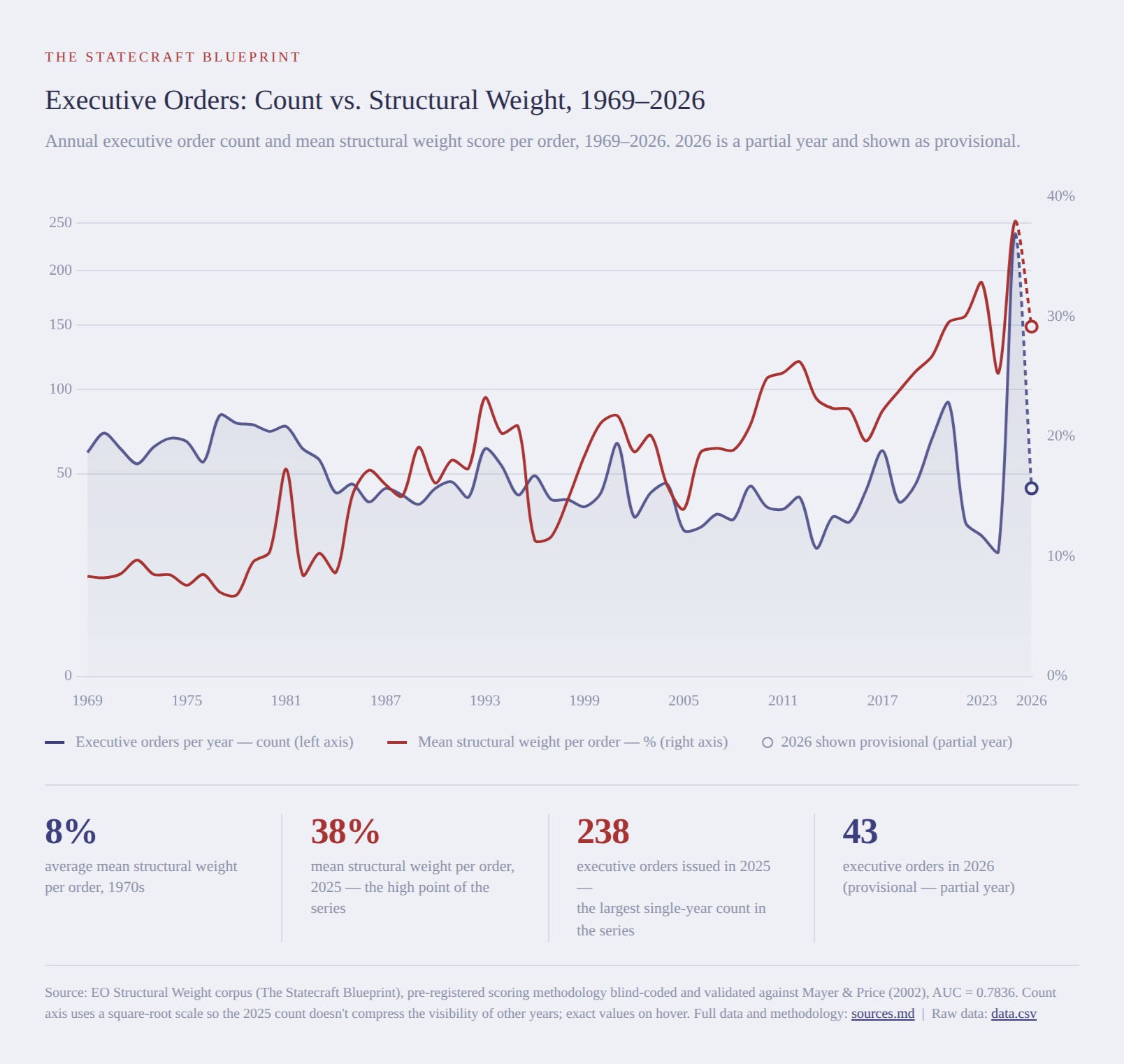
This chart shows how many executive orders were written each year (blue shaded area) along with the average “structural weight score” (red line).
A simple executive order, such as Ford’s E.O. #11785 which dismantles the Attorney General’s list of subversive organizations scores a 0.0%, because it doesn’t deploy any new governance machinery, it constrains governance. Carter’s E.O. #12139 deploys significant governance machinery, but it names specific officials, every operative clause is anchored to statute, and anything beyond the statutory exceptions requires going to court (judicial backstop), resulting in the same 0.0% score.
That last order illustrates the difference between the significance score and the structural weight score. E.O. #12139 implemented FISA, the foundational surveillance-oversight statute, and one of the orders Mayer & Price flagged as most consequential. And yet, the structural score is zero. In this case, both things are true: the order was enormously consequential, and it was built with restraint. A measure that sorts into “significant” and “not” can’t capture this additional information.
E.O. #9066, FDR’s Japanese American internment authorization, does not show up on the list of significant orders, but has a structural weight score of 77.27%. To me, an order that defines no criteria for exclusions, no independent review, no expiration, and relies on one official’s judgement applied to “any or all persons” is a significant expansion of executive authority.
The number of orders issued each year can vary drastically. Overall the number (except for most recently) has stayed flat, or perhaps gone down. But over the same period of time, the orders have gotten heavier on average.
The metrics so far have shown that over the past few decades Congress is solving fewer and fewer societal issues, has become more polarized, works more in extremes, has a consistently decreasing approval rate from its constituency, and is being superceded by the Executive Branch in the form of Executive Orders.
The astute reader may be wondering about two topics of Congress that are frequently discussed, but haven’t been presented. And there’s a good reason: there’s no reliable data.
Observation 9: Revolving Door (Honorable Mention)
Let’s begin with lobbying. Regardless of your feelings on it, lobbying is a part of our government; the First Amendment gives every citizen the right to “petition the government for a redress of grievances.” If you want to understand lobbying in more depth, there have been many books written about it.
In a nutshell, it’s an old, informal practice that got layered with disclosure requirements starting in 1946 and has been upheld by the courts as compatible with the right to petition. More recently Congress added a registration requirement and tightened the disclosure requirements in the wake of scandals.
What this means for us is, there is a dearth of data about lobbying for us to draw on. The requirement to register went into effect in 1996, but OpenSecrets’ online searchable database only goes back to 1998. Before that the data is only as reliable as what lobbyists and members disclosed.
One aspect of lobbying that would be especially interesting to examine is how often and how seriously members of Congress become lobbyists themselves. Some efforts have gone into researching this. Lazarus, McKay, and Herbel published “Who Walks Through the Revolving Door? Examining the Lobbying Activity of Former Members of Congress,” Interest Groups & Advocacy, Vol. 5, Issue 1 (2016), pp. 82–100. Lazarus, et al. examined departing members of Congress to identify those who began lobbying after leaving office. Their research showed:
Before 1980, roughly 2% of Senators and 4% of Representatives engaged in lobbying after leaving office
The overall average from 1976 to 2012 was 29% of Senators and 25% of Representatives engaged in lobbying after leaving office
The 2012 cohort of departing Senators and Representatives was 60% and 50% respectively
Those numbers tell us that it has become common practice for members of Congress to leave office and become lobbyists. But the numbers before 1996, and especially before 1980 are almost certainly understated since they relied on lobbyists disclosing their activities.
Alternatively, Public Citizen published two reports:
2005 (https://www.policyarchive.org/handle/10207/10858) showed 43% of members who left 1998-2004 became registered lobbyists
2019 (https://www.citizen.org/article/revolving-congress/) showed that of the members who left the 115th Congress, 59% took a position built to influence policy, and most of those went straight to registered lobbying.
This illustrates how little data we have about an important aspect of our political system, making a murky, grey area even murkier and even greyer. Making things worse, the numbers we do have likely understate what’s actually happening. The Lobbying Disclosure Act sets the registration bar at $3,000 a quarter and at least 20% of a person’s time spent lobbying for a single client, anyone under that threshold isn’t required to register at all. This was brought to light when it was discovered former Senate Majority Leader Tom Daschle spent years doing just that.
But the numbers we do have are not worthless. Two independent research efforts, using different methods and different date ranges, agree on the direction: the revolving door continues to swing wider. We just don’t have the precision here that we do for the previous observations. Think of this as an instrument with limits: trustworthy in direction, but not in magnitude. Like our doctor with an imprecise reading, we can note the imprecision, add the reading to our panel, and move onto the next test.
Observation 10: Personal Wealth Accumulation
One particular area of Congressional dysfunction I’ve had my eye on for a very long time is Congress members accruing personal wealth while in office. It’s a regular topic in the media, and with good reason.
Members of the government are privy to sensitive information, information that can move markets. If the government is preparing to crack down on a public corporation, that corporation’s stock price is going to take a major hit. This is valuable, privileged information posing a real temptation to use it for personal gain.
So when reports like “Marjorie Taylor Greene: $700,000 to $25 million since joining Congress,”2 or “Nancy Pelosi’s family turned $30 million into $278 million trading stocks”3 are published, they spread like wildfire. And why wouldn’t they? They use our confirmation bias and tunnel straight to the amygdala triggering anger and righteous indignation.
But if you read beyond the headline, the reports themselves tell a less damning story. MTG’s $700,000 is real, but it’s her stock portfolio alone, not her $25 million net worth which includes real estate and her family’s construction business she owned years before running for office, and was disclosed on her pre-Congress disclosure statement. Pelosi’s data is similar: the underlying report points out these aren’t before and after numbers, but the same balance sheet read two ways, on the same day. The $30 million is the stock and options portfolio sitting inside a $278-280 million dollar net worth which includes real estate and decades old holdings.
Moving past the media articles and digging into data doesn’t yield better results. Ballotpedia’s Personal Gain Index4 says: “top 20 members gain an average of 422% per year.” The data itself stops in 2012 (published in 2014), and their methodology notes say the net worth changes behind it “may include changes from assets gained through marriage, inheritance, changes in family estates and/or trusts, changes in family business ownership, and many other variables unrelated to a member’s behavior in Congress.” And their own top 20 average excludes one member, Rep. Chellie Pingree, whose gain is 73,039%, specifically because that gain came from marriage, not trades. The same dataset’s far less quoted number: across the whole of Congress, median net worth rose 1.55% a year over that period compared with 0.94% median decline for American households over the same years.
None of this is to say wealth accumulation by members of Congress is not a real thing. Corruption happens, Senator Bob Menendez was convicted in 2024 on all sixteen felony counts against him after investigators found $480,000 in cash hidden around his home and thirteen gold bars in a closet. That corruption is real, proven in court, but it is the exception, not the rule. A criminal conviction tells you one member broke the law and the system to catch corruption works, but doesn’t tell us if there is a pattern.
The real question is about stock trading: is it a problem, or is it not? If your knowledge of the top stops at news articles (particularly the headlines), it seems like an open and shut case. But once again, diving into data muddies the picture. Two peer-reviewed studies found senators’ stock purchases beat the market by roughly 11% per year, using data from 1993-985, and a companion study found House members beat it by roughly 6% a year using 1985-2001 data6. But both predate the STOCK Act of 2012 which required members to disclose their trades within 45 days.
The most careful attempt to check the disclosed trades showed the average member’s portfolio did worse than a plain index fund: $100 invested the way the average member of Congress invested it returned $69 versus an index fund’s return of $80.7 Individual members can, and do, beat the market in a given year, but “Congress beats the market” as a general claim is an overstatement.
I spent a significant amount of time and energy trying to pin down some solid numbers on the issue, but all the data I could find failed even modest scrutiny. So what can we take away from this? Sadly not much. There could be a systemic problem, but the information we currently have is at best contested. It lands as an inconclusive test on our panel.
Why am I including an inconclusive result on the panel? It is meant as a demonstration of the methodology. Evidence that doesn’t hold up is noted to provide a more clear picture of the situation.
Conclusion
Whew, that was a lot. Eight independent metrics, each measuring a separate part of our government, along with one imprecise test, and one inconclusive result. Just like our doctor can evaluate her patient’s condition using multiple measures, we can finally evaluate our patient: U.S. Congress.
So what does our panel say about whether Congress is able to fulfill its responsibilities? Let’s review:
Observation 1: Negative - Congress continues to pass legislation, but less and less of it actually solves problems facing our society
Observation 2: Negative - Government shut downs have become an issue
Observation 3: Neutral - Incumbency has remained high the entire time
Observation 4: Negative - Party line voting has increased significantly
Observation 5: Negative - There are fewer moderate members in Congress
Observation 6: Negative - Citizens have low approval ratings
Observation 7: Negative - Citizens feel their representatives don’t care
Observation 8: Negative - Executive orders carry more structural weight
Observation 9: Negative - Legislators increasingly turn to lobbying after their terms
Observation 10: Inconclusive - We can’t say for sure or how much legislators use their position for personal gain
Nearly all observations are negative, which strongly suggests our patient, U.S. Congress, is not in good condition. Our legislature is failing to fulfill its responsibilities, pass legislation and keep the lights on, while members work together less and executive orders have increasingly contained more governance.
I doubt anyone would be surprised to hear Congress isn’t fulfilling its responsibilities; this is something most of us have long suspected. But we can’t evaluate a system based on suspicions, we need independent, empirical data so we can formulate explanations and develop solutions.
And that’s what we will do in the next chapter.
DW-NOMINATE (”Dynamic, Weighted NOMINATE”) is a statistical method developed by political scientists Keith Poole and Howard Rosenthal that estimates each member of Congress’s ideological position from their roll-call voting record alone, not from self-reported views. It places every member on a scale from -1 (most liberal) to +1 (most conservative) based on the pattern of who votes with whom across tens of thousands of votes, and — critically for comparisons over time — anchors those scores in a common scale so a member’s score in 1971 is directly comparable to a member’s score in 2025. Data: Voteview (voteview.com), maintained by UCLA’s Department of Political Science.
Rudro Chakrabarti, “Marjorie Taylor Greene’s stock portfolio jumped 476% since joining Congress,” Moneywise, Dec. 1, 2025, https://moneywise.com/news/investing/marjorie-taylor-greenes-stock-porfolio-jumped-476-since-joining-congress; “Marjorie Taylor Greene hits out at net worth claims: ‘Go to hell,’” Newsweek, https://www.newsweek.com/marjorie-taylor-greene-net-worth-claims-insider-trading-2111774
Joel South, “Nancy Pelosi’s Family Turned $30 Million Into $278 Million Trading Stocks. Congress Just Voted to Ban It During Her Final Term.,” 24/7 Wall St., July 23, 2026, https://247wallst.com/investing/2026/07/23/nancy-pelosis-family-turned-30-million-into-278-million-trading-stocks-congress-just-voted-to-ban-it-during-her-final-term/
"Changes in Net Worth of U.S. Senators and Representatives (Personal Gain Index)," Ballotpedia, https://ballotpedia.org/ChangesinNetWorthofU.S.SenatorsandRepresentatives(PersonalGain_Index)
Alan J. Ziobrowski, Ping Cheng, James W. Boyd, and Brigitte J. Ziobrowski, “Abnormal Returns from the Common Stock Investments of the U.S. Senate,” The Journal of Financial and Quantitative Analysis, vol. 39, no. 4, 2004, pp. 661-676, https://www.jstor.org/stable/i30031877
Alan J. Ziobrowski, James W. Boyd, Ping Cheng, and Brigitte J. Ziobrowski, “Abnormal Returns from the Common Stock Investments of Members of the U.S. House of Representatives,” Business and Politics, vol. 13, no. 1, April 2011, https://digitalcommons.lindenwood.edu/faculty-research-papers/240/